2026 - UI Design / Web Design

MAVEN
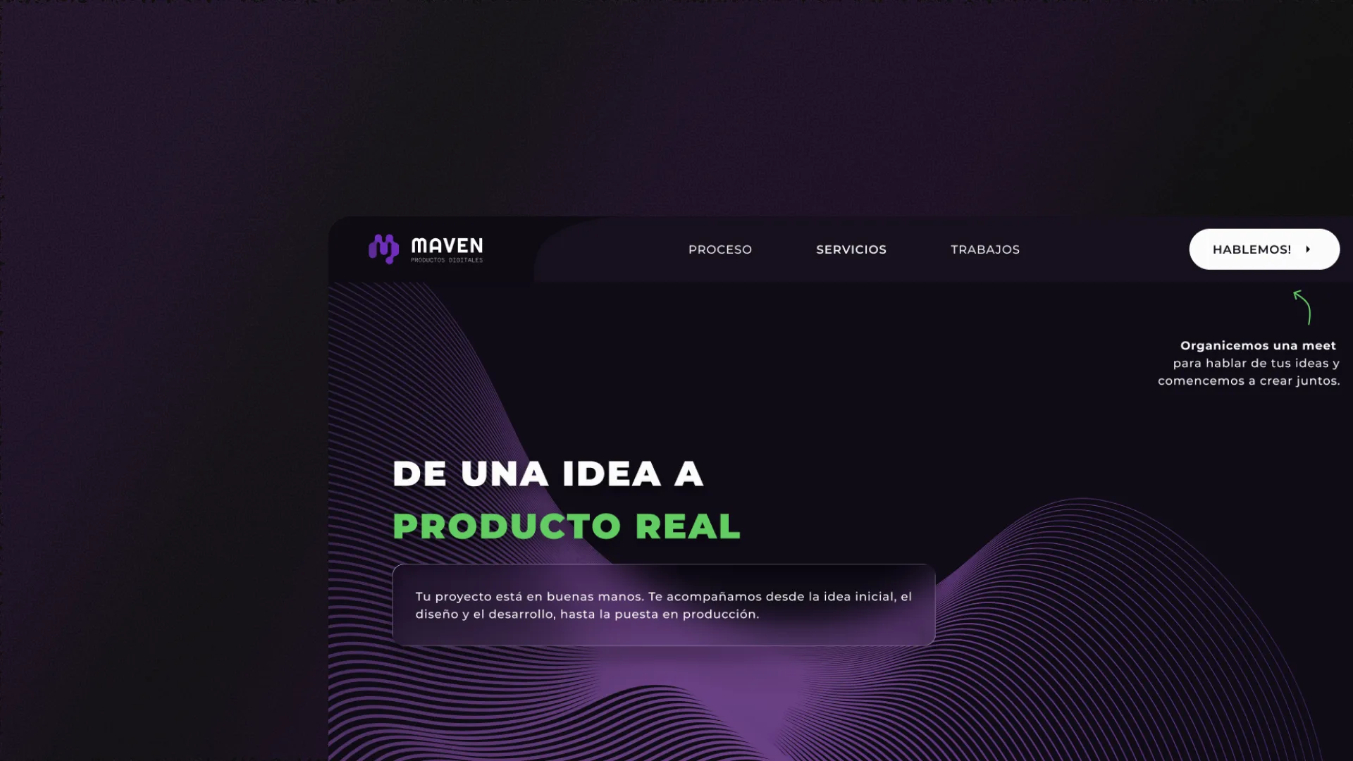
Landing page designed in Figma and developed with Vibe Coding using Claude Opus 4.6, integrating Supabase and Resend. Dark mode focused on conversion and technological credibility.
— Role sheet
- Role
- UX/UI Designer
- Team
- Franco Gregoratti, Matías Gregoratti (Graphic Designer) + 3 more people
- Duration
- 3 days
- Platform
- Web / Business
- What I did
- User interface design and branding
— Context
No digital presence reflecting their AI
MAVEN operated as a software development and IT solutions company without its own website to communicate its specialization in AI-powered automation. The lack of a cohesive digital identity made it difficult to capture qualified leads and communicate its differential value proposition.
MAVEN needed a landing page with strong aesthetics and a functional contact form in a short time, meeting tight deadlines. The challenge was to design and develop a solid MVP in less than 3 days without sacrificing visual quality or user experience.
— Solution
A landing page that communicates technical
A dark-mode corporate landing page was designed to organize information into four main sections —Home, Services, Processes and Contact— with clear navigation and visual hierarchy that guides the visitor toward conversion.
The process began with an AI-assisted benchmark in ChatGPT 5.2 to define structure and key decisions. It was then designed in Figma and developed with V0 using Claude Opus 4.6 for vibe coding. Supabase was integrated for image uploads and Resend for the functional contact form. The handoff included the Figma design and functional code, which the client deployed to their own GitHub, server and domain.
— Features
Sections designed to convert
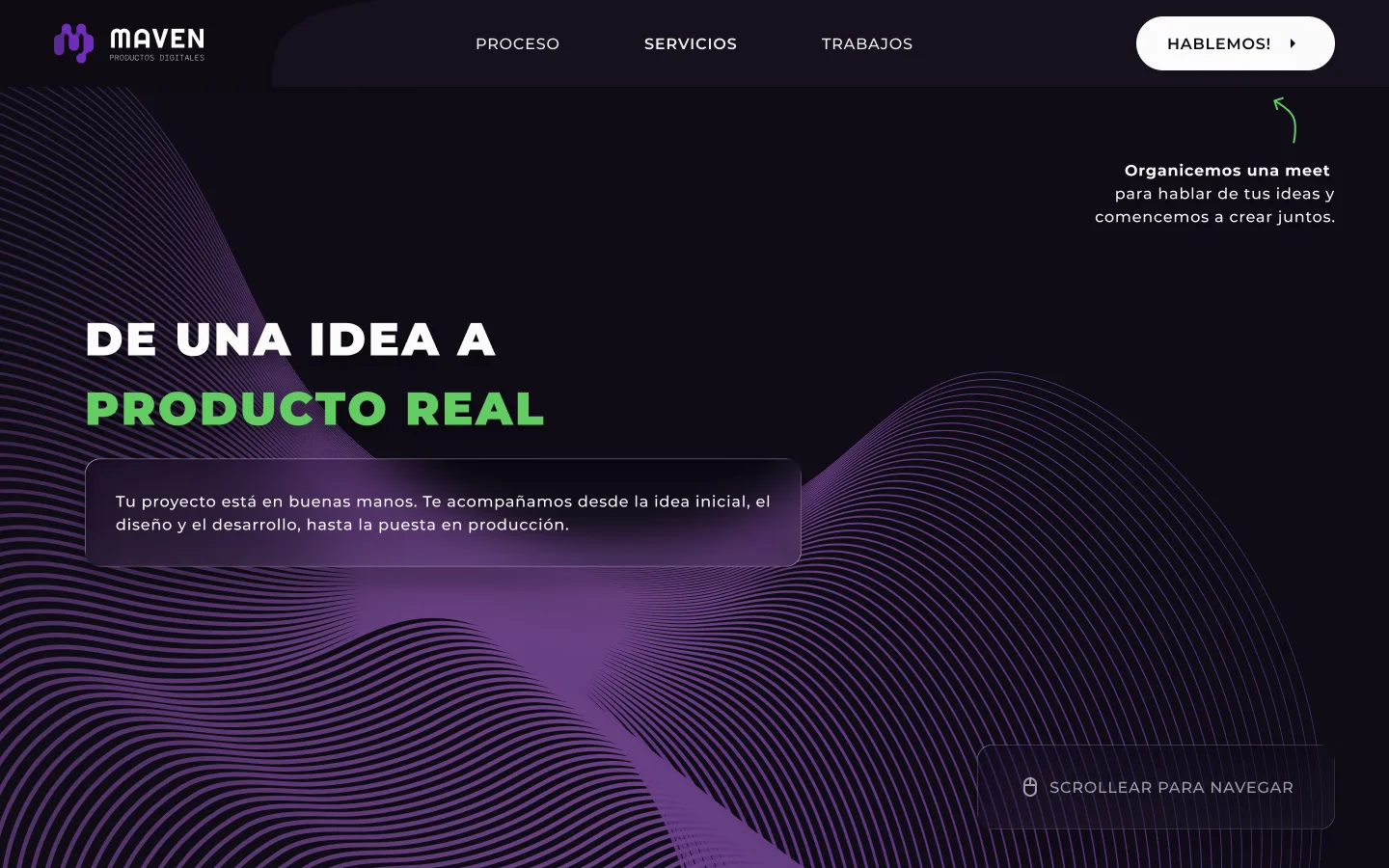
HomeClear value proposition
Hero with MAVEN's positioning as a software developer and IT solutions provider with AI. Direct message about automation and technology applied to business.
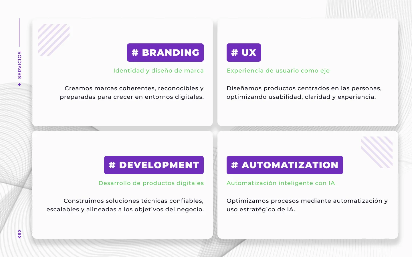
ServicesAutomation and development
Clear listing of services: software development, AI automation, IT solutions and technology consulting. Each service presented with clean structure and technical language.
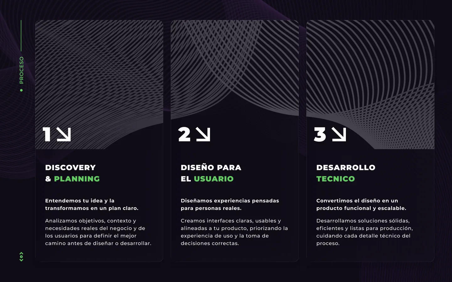
ProcessesHow MAVEN works
Visual workflow explaining the work process: from initial diagnosis to implementation and support. Builds trust by transparently showing the methodology.
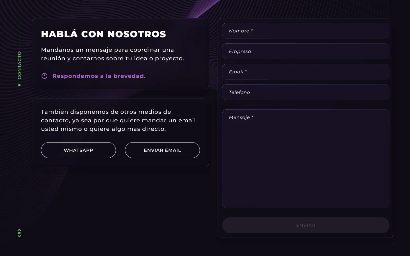
ContactCommunication channels
Contact form and direct communication channels. Designed to capture qualified leads with relevant fields for the type of service requested.
— Tech stack
Design and prototyping tools
The process began with an AI-assisted benchmark using ChatGPT 5.2: queries for structure, competition and industry trends. Prompts were created for other AIs and the most efficient generative background model was defined. Then low- and high-fidelity mockups were created in Figma. Development was done with V0 and Claude Opus 4.6 (vibe coding), integrating Supabase for images and Resend for the contact form. The handoff included Figma design + functional code.
— Results
From design to MVP in record time
03
days from design to functional MVP
02
iteration phases to reach the final version
— Key decisions
Decisions that shaped the project.
Building with vibe coding — the 3-day deadline
The problem
MAVEN needed a highly polished landing page with a working contact form in under 3 days. A traditional development process couldn't come close to fitting that timeline.
The options
- —Traditional development with a dev writing code from scratch: maximum control, but impossible to deliver in 3 days.
- —A no-code builder like Webflow or WordPress: fast, but with less control over the code and a more limited handoff.
- —Vibe coding with V0 and Claude Opus 4.6: extreme speed with real, exportable code, at the cost of less fine-grained control over every line.
The decision
I chose vibe coding with V0 and Claude Opus 4.6 because it was the only path that combined speed with a serious deliverable: functional code the client could push to their own GitHub, server and domain. I integrated Supabase for image uploads and Resend for the contact form instead of building a custom backend. The trade-off was accepting less granular control over the code and capping the project at two iteration phases: I prioritized a solid, working MVP over endless refinement.
AI-assisted benchmark — research in hours, not weeks
The problem
With 3 days total to design and develop, there was no room for a traditional benchmark: manually researching competitors, structure and industry trends would have eaten most of the timeline.
The options
- —Traditional manual benchmark: deeper and more verifiable, but incompatible with the deadline.
- —Skip research and go straight to design: fast, but risky — the structure could end up disconnected from the industry.
- —AI-assisted benchmark with ChatGPT 5.2: structure, competition and trends in hours, with less depth than manual research.
The decision
I chose the AI-assisted benchmark: I used ChatGPT 5.2 to query structure, competition and industry trends, and even to define the most efficient generative background model. That gave me a grounded basis for key decisions without burning the timeline. What I gave up was research depth: with more time, a manual benchmark would have added nuances the AI doesn't surface.
Dark mode as identity — tech credibility vs. corporate convention
The problem
MAVEN sells AI automation and IT solutions but had no digital identity. The landing page had to communicate technical authority at a glance, and strong aesthetics were an explicit client requirement.
The options
- —Standard corporate light mode: safe and conventional, but generic and poorly differentiated for an AI company.
- —Dark mode with accents and a generative background: strong tech identity, with a readability risk that demands very careful visual hierarchy.
The decision
I chose dark mode because the goal was technological credibility and conversion, not corporate convention. The purple generative wave background adds identity without competing with the content. To manage the readability risk I built a clear hierarchy: prominent headlines, secondary descriptions and CTAs differentiated by accent color. I traded the 'safety' of a traditional light site for a memorable identity.
— Next steps
Learn more about MAVEN
Corporate landing page designed to generate technological trust and facilitate contact. Functional dark mode with a focus on user experience.